Some colours that contrast, work well together because they make each other stand out. The colour palettes below show how these work.
Warning signs are usually black and yellow because the colours contrast, this makes the black writing jump out because its a totally different colour to the yellow, the yellow is very bright whereas the black writing is really dark.

These 8 Colour palettes are colours that would work together, the majority of magazines include black or white or both, the top 5 include one colour that's bright and will stand out from the black and white on the page. The bottom 3 include black but instead of one main colour there's two which contrast against each other.
Most magazines stick to 3 colours for the front page. But this one for example has Black, White, Orange and Blue this still works because the orange and blue contrast against the white and black. The scale above is the complementary colour scale, the colours that are opposite each other contrast the most, which makes them complement each other. Orange and blue are opposite each other on the scale which shows us that the are contrasting colours so are likely to work well together.

Other magazines like this one stick to colours which are basically the same just different tones and shades. All of the colours are different shades and tones of turquoise then there's the black, This works well with the magazine because its like a theme colour and it makes the models body stand out because there's not much black used on the page but shes wearing a black dress.
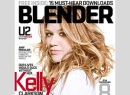
I think i am going to be using a aqua/turquoise theme throughout my magazine as in esquire and blender the turquoise colour is very aesthetically pleasing. If my model were to have green/blue eyes the aqua would bring out the colour of her eyes.


A large majority of magazines use basic fonts, which allow the magazine title to stand out making a bold statement.
Broadway
Eras Bold ITC
Franklin
Gothic Heavy
Gill Sans
Ultra Bold
Rockwell Extra Bold
Haettenschweiler
Verdana
Cooper
Black
Britannic Bold
Ar
Julian
These types of fonts are the type magazines use for their masthead, personally i prefer font styles without serifs because when fonts have serifs i don't think they look as bold.


Good research and reflection.
ReplyDelete