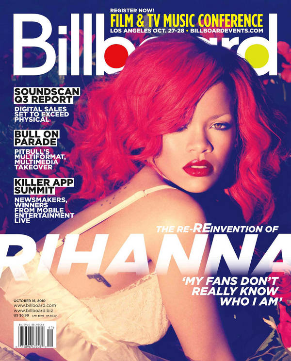
 This magazine includes an image of Rihanna in full colour, because of her red hair is attract the audience as there's alot going on in on the front page. It includes features that are in the magazines to give people an idea of what its about. Her name is in a bold font covering her body, its bigger than the masthead and more visible but because its a well known magazine they don't need to have the masthead fully visual because people will know exactly what it is. The writing under her name is a quote from Rihanna herself which gives people an insight of why shes on the front cover of the magazine, and what the article about her is going to be about.
 The billboard contents page include the charts down the left hand side of the page. The images used are simple photos like the layout which is again in columns, but in this case the also include a 'home front' which is the events and online activity related to the magazine. The title for the contents page is in a bold statement font, but black because its not the main focus of the page its just what the page is.
 This Double page spread includes a full body image of rihanna in a white dress on a white backdrop, this makes her bright red hair stand out of the image. the writing around is black and white with blue splashes in random places which contrasts against rihannas hair. The top right corner there is a sub heading which shows the whole spread is on her, the main heading is a quote of what rihanna said.
To improve this further, you should aim to use more of the terms on Mr Smith's blog.
ReplyDelete